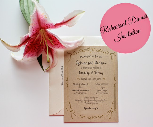
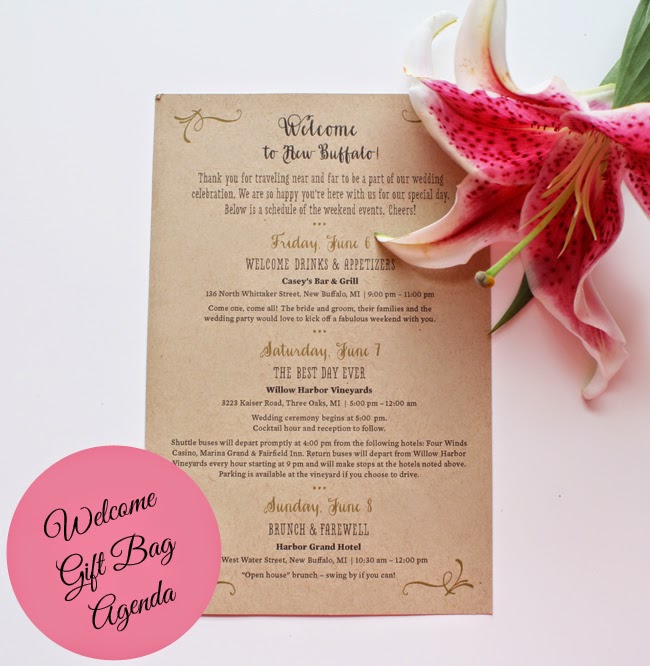
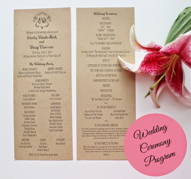
When choosing what our wedding invitations and paper would look like, Doug and I knew a few things for certain. First, we wanted all the printing to convey the tone and setting of our wedding. Second, we wanted there to be consistency throughout it all. {Okay, that was maybe more my request than Doug’s.} And, third, we wanted it to be personal.
We went to paper stores in the city, and while the options were great, none of them struck a cord with us. So, I turned to the fail-proof Etsy, which is where I found Harken Press. Brynn, who’s the designer behind the small shop based in California, designed her own vineyard wedding suite for her wedding, and I adored it. The suite was rustic and infused with a whimsical touch, which was exactly what we were looking for.
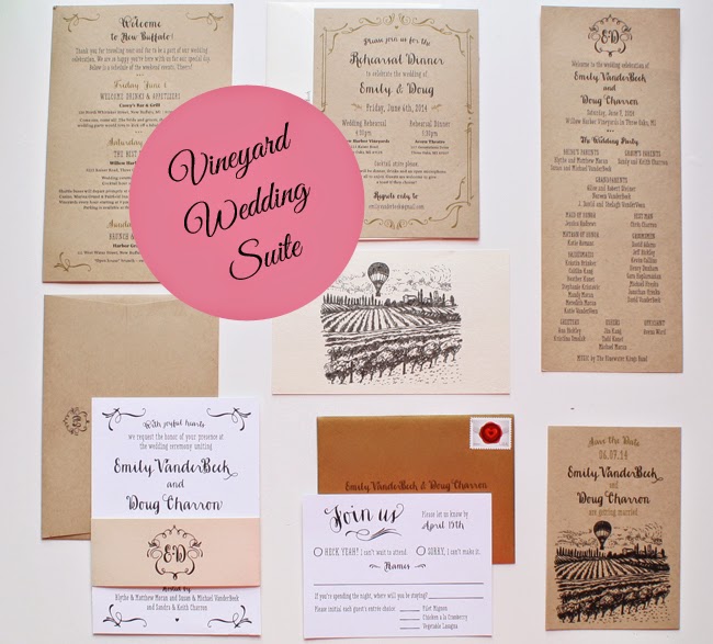
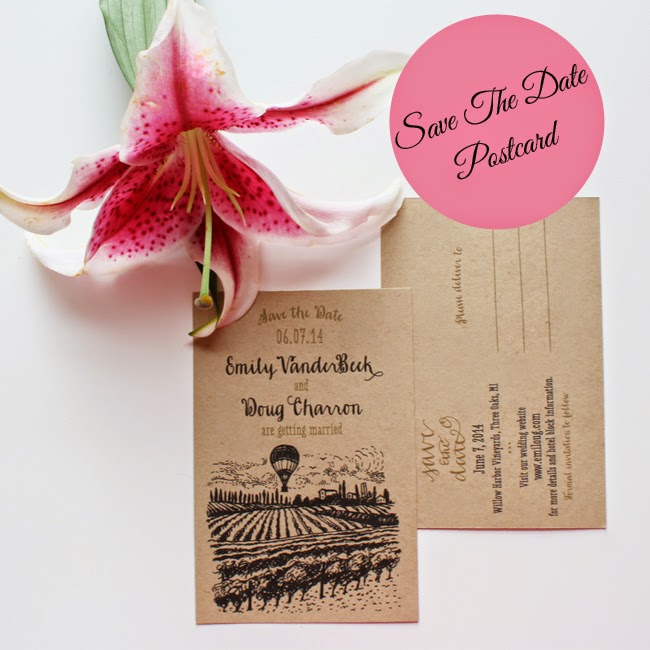
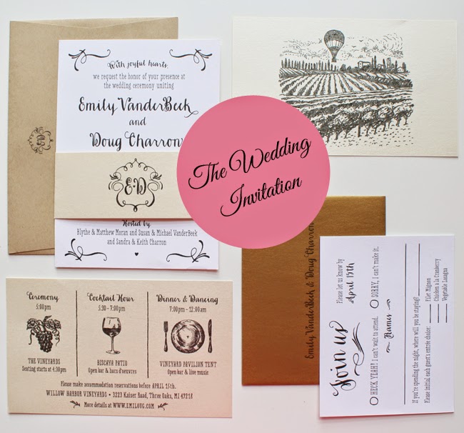
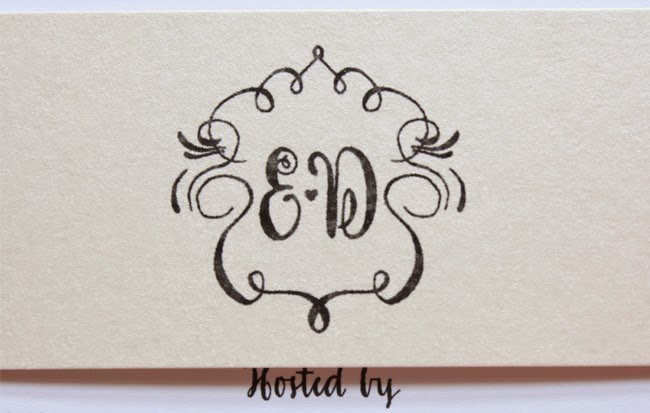
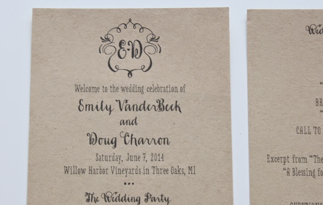
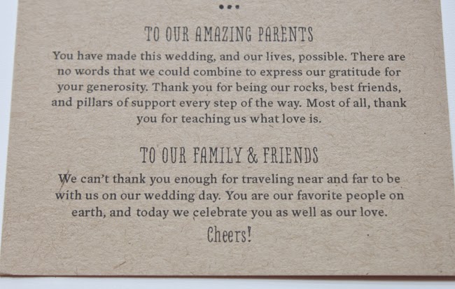
Brynn worked with us to design everything from our save the date postcards to our ceremony program. Everything was customized to our requests and it was so fun to create everything with her. We played around with colors and paper texture, and landed on moving forward with a kraft paper as the main focal with champagne shimmer and ivory white paper as the accents. For the guest reply card, we threw in a gold shimmer envelope to add an extra pop of personality. My favorite part of the end result was the “E <3 D” emblem that was used throughout the wedding.
Below is our final vineyard wedding suite, laid out for your viewing pleasure! Hope you enjoy.



2 comments
These came out so so lovely, Emily! I love the craft paper and the script used on everything. Perfect!
they are beautiful! i love the font! xo jillian – cornflake dreams